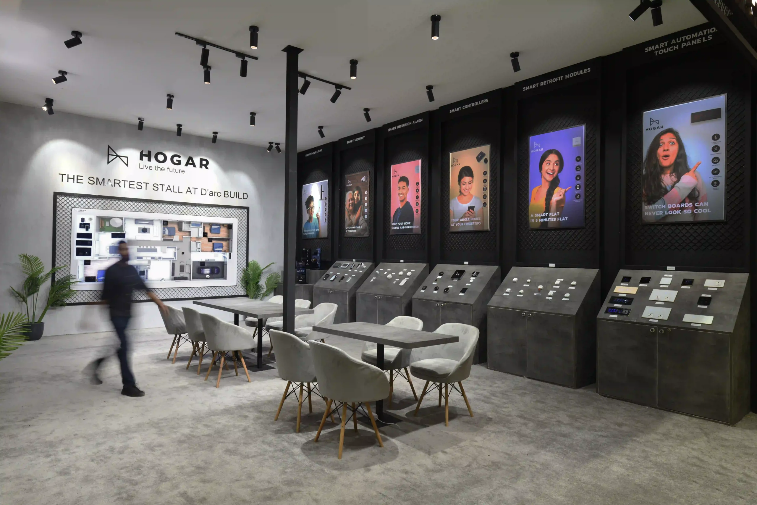
Hogar & Supersurfaces
AREA: 153 sqm.
LOCATION: Pragati Maidan, New Delhi
The design brief consisted of an interactive experience zone to be designed for a consortium of home automation and premium texture paints company. The site was at the Ultra Luxe pavilion at D’ Arc Build, New Delhi 2022 which saw the presence of some of the high end companies in the building materials industry.
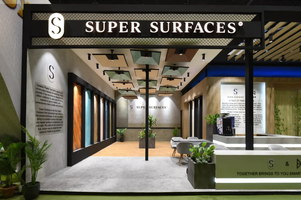
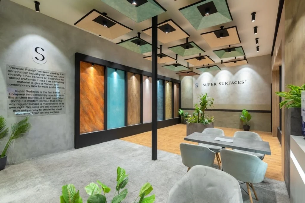
The program devised was to be two fold in order to fulfil the requirements for both the companies and still look and feel as a singular entity to demonstrate the varied work they do and show how they have joined hands for their shared vision.
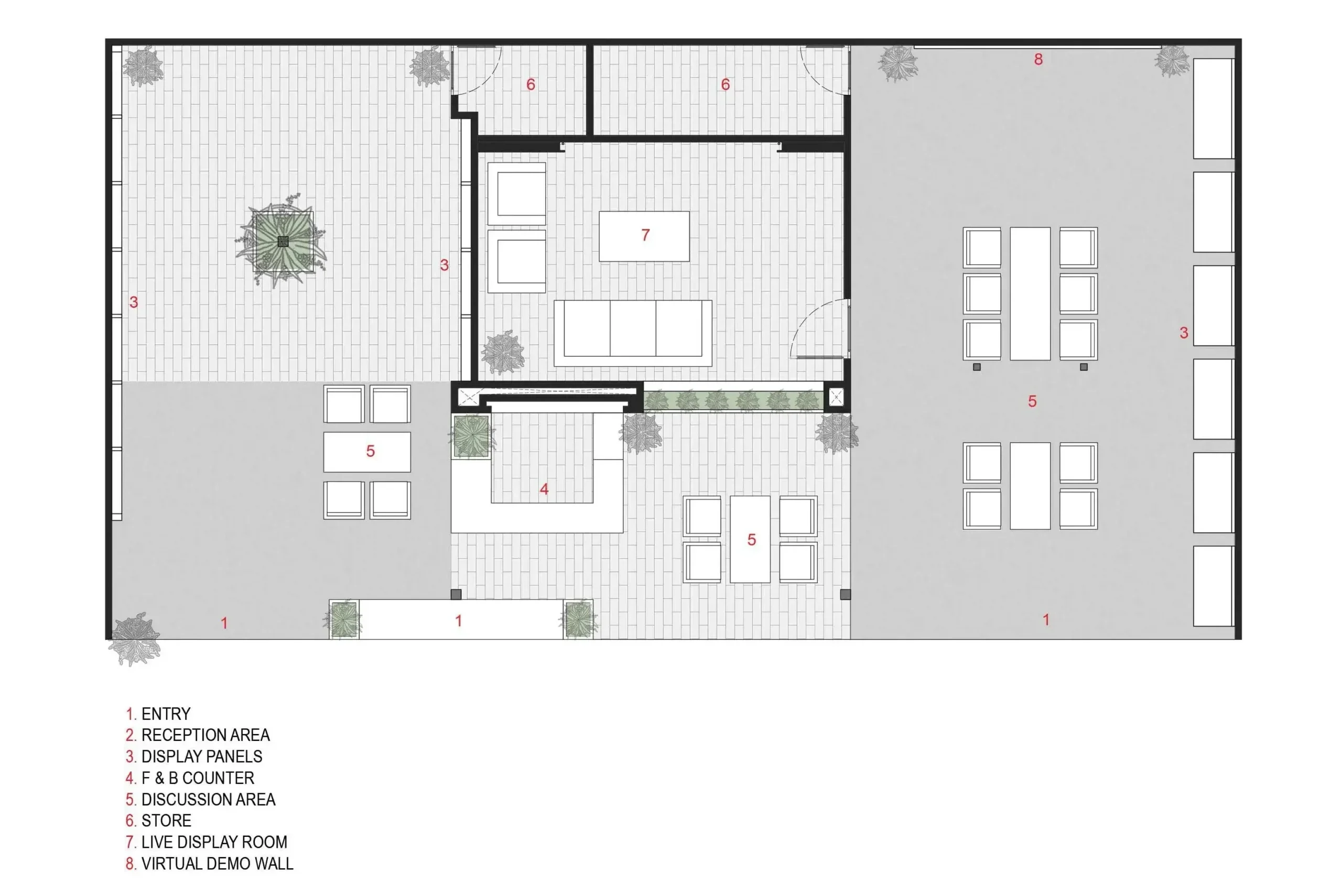
Our site faced the main stage area and was only 2 side open but due to a column on 1 side we could only consider 1 side to be fully usable hence, it only made sense to open up 1 side of the space completely to maximise our visibility and make it our entry. This brought equal attention to both sides of the stall and maintained a similar experience for the visitor when they are at either side. The space was segregated into 3 zones giving both the brands equal display and circulation space and then between them was the F&B counter and meeting space along with a live display room and storage space.
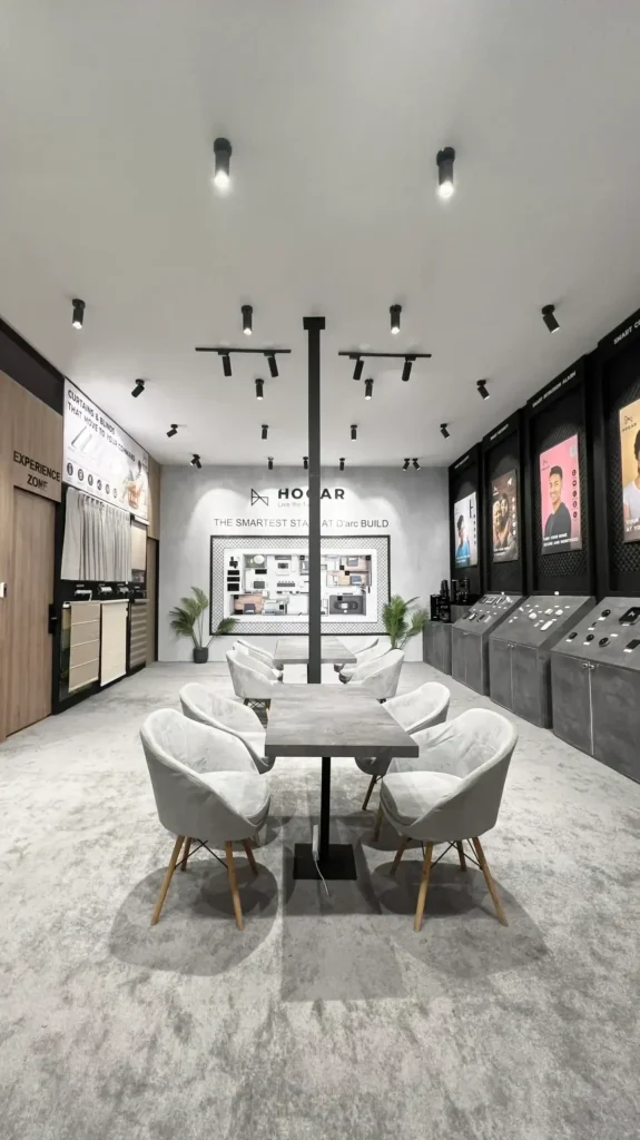
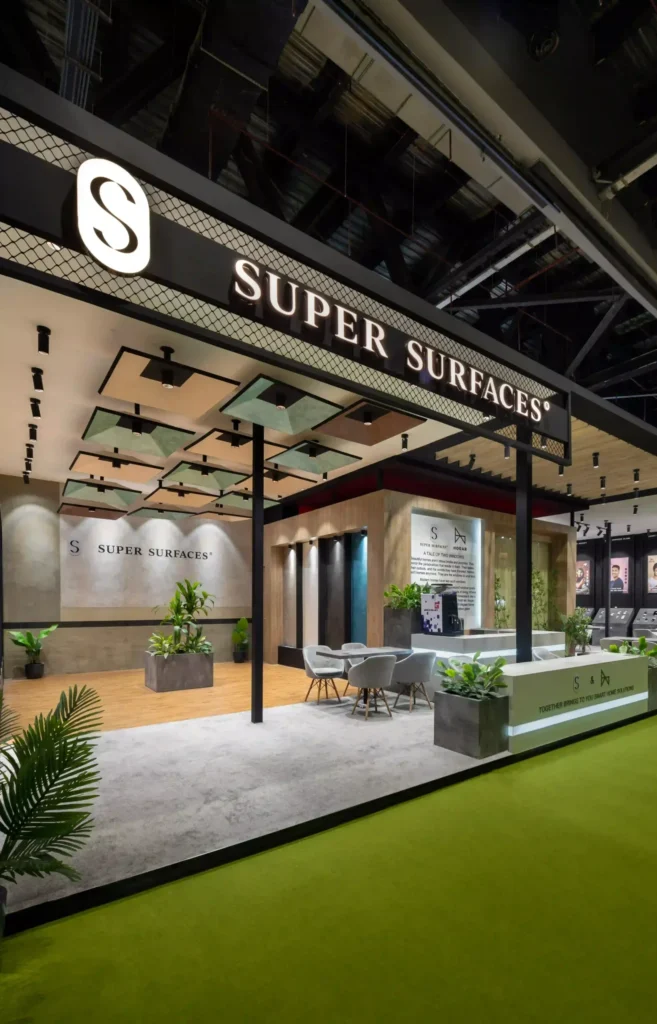
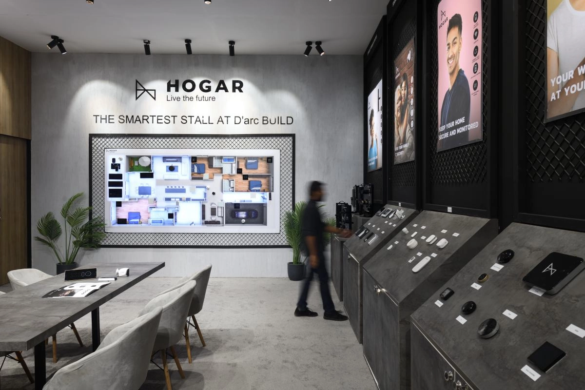
In the outer facade we designed illuminated branding on both sides with a black background. For super surfaces, the whole space had texture painted walls. As soon as one enters they can see the company profile which was vinyl cut letters on transparent acrylic sheet in order to have minimum visual obstruction on the textured surface.
At the middle was the F&B counter along with some seating space. The backdrop for which was a custom textured finish along with the brand story for both the brands. This wall also had a big cutout with fixed glass and tall bamboo planters for the live display experience zone for Hogar controls where they could showcase their products to prospective customers. This zone was fully decked up with an 8’ rolling projector screen, AC, remote controlled ambient mood lighting, TV, speaker systems etc.
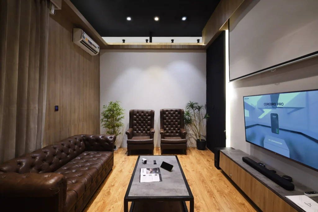
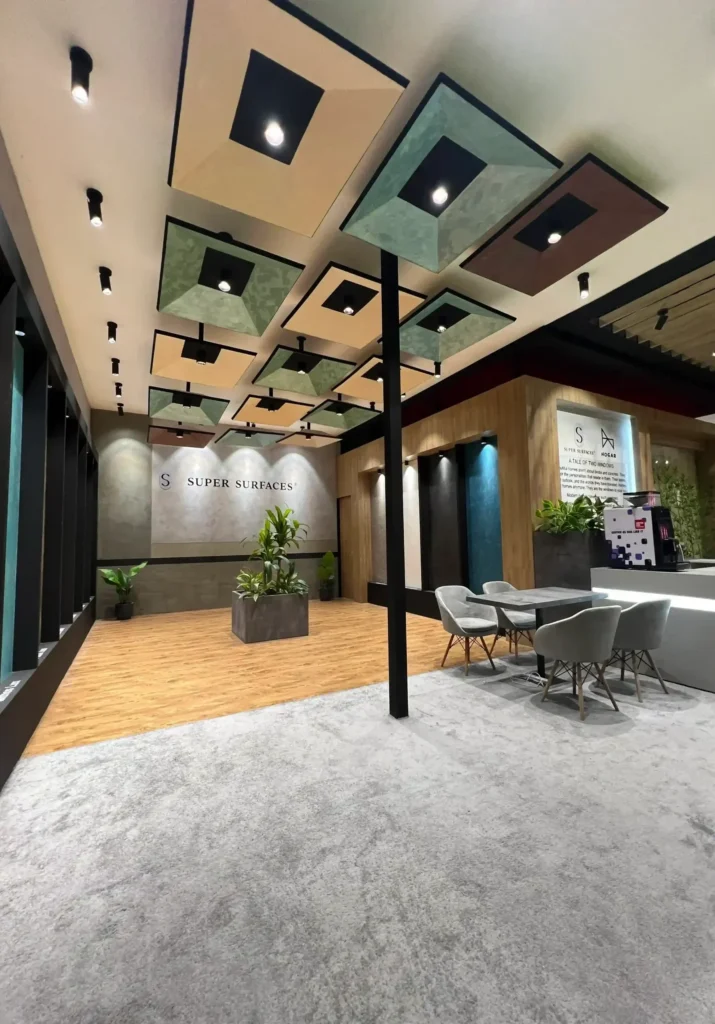
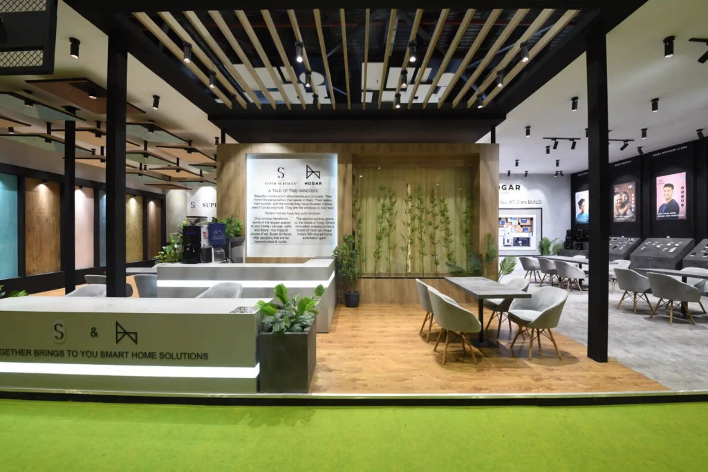
For the ceiling, plain white ceiling was used in order to get more light to reflect. Above the common meeting space the ceiling had wooden louvers running along the entirety of the live demo room to break away from the plain white colour and introduce the warmth of wooden texture.
